Client
Duration
#
Branding
A Brand Taken to The Next Level
Rebranding a premium cosmetics brand with a strategic naming evolution, elegant bespoke typography, and a luxurious visual identity designed to ensure a seamless market transition and sustain deep customer loyalty.


About the project
A strategic visual transformation to elevate a premium Saudi cosmetics brand.
3ALAMTK partnered with the prominent Saudi cosmetics brand for a comprehensive visual and strategic overhaul. The primary objective was to transition the brand to its new name, "ALSO," while building a sophisticated visual language that accurately communicates the luxury, high quality, and elegance of their product line within the competitive beauty sector.

Challanges
Navigating an urgent legal name change without losing established brand equity and customer loyalty.
The brand faced a critical turning point: an urgent legal mandate to change its name from "So Cosmetics" to "ALSO Cosmetics" to successfully meet trademark documentation and registration requirements. The core challenge was preserving brand equity. We needed to execute this major naming transition without destroying their established brand recognition or alienating a loyal customer base. It required striking a precise balance between achieving a legally registrable, unique identity and preserving the "original soul" and foundational visual footprint the audience already trusted. We had to ensure the current audience felt no friction or alienation during the transition, despite the highly competitive nature of the market.


Summary
Evolving the brand through bespoke typography and heritage color retention to ensure a seamless market transition.
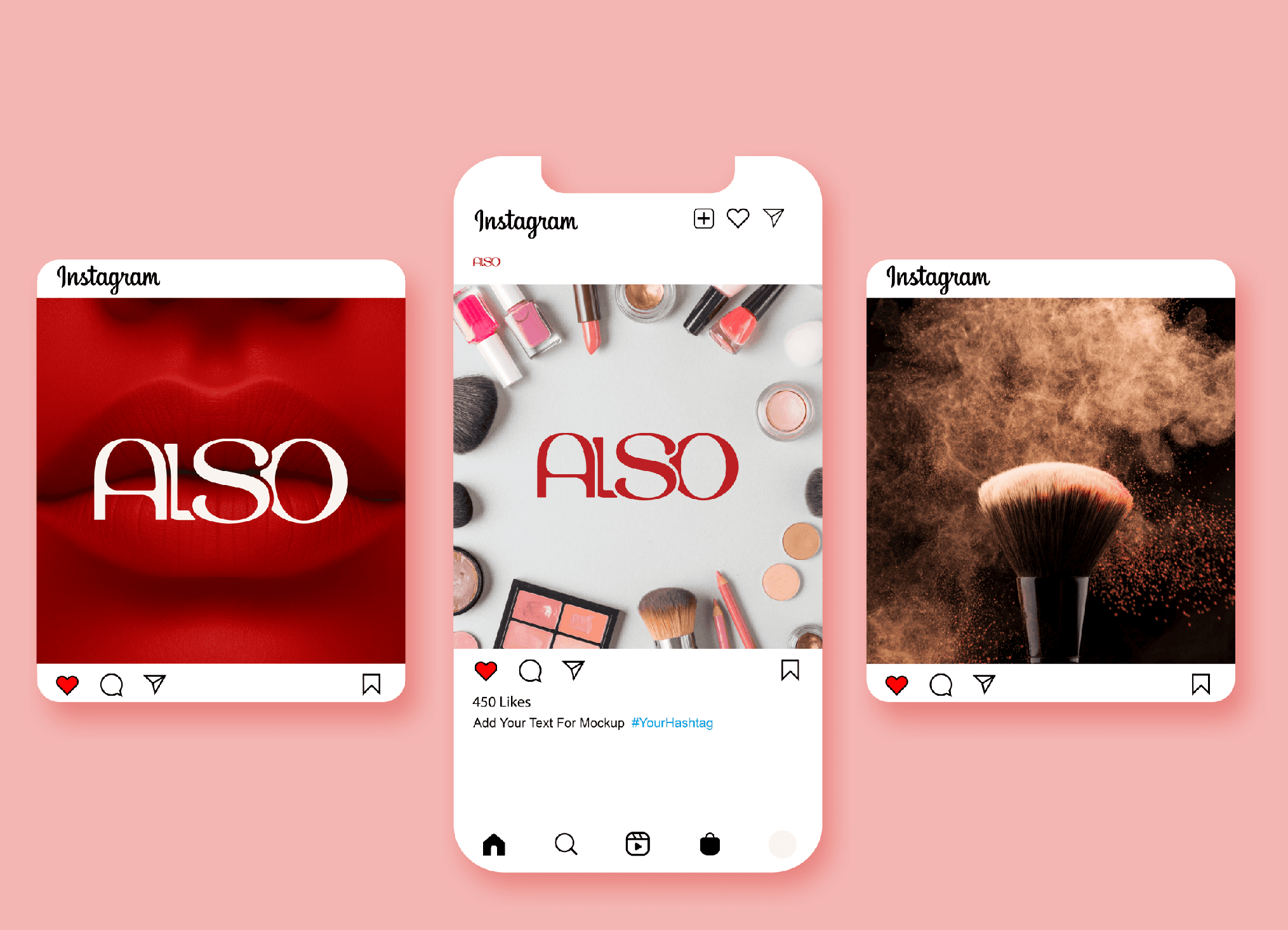
Operating under the strategic philosophy of "evolution rather than revolution," we developed a visual system that serves as a bridge between the brand's past and its future. We designed a custom, bespoke typographic logo for "ALSO," with letterforms crafted to smoothly intertwine, visually representing the softness, grace, and femininity inherently associated with premium cosmetics. To maintain a strong emotional and visual connection to their existing audience, we strategically retained the brand's iconic red color palette and preserved the classic typographic character that defined the original "So" identity, ensuring instant visual recognition. While keeping these foundational elements, we refined and elevated them, pushing the overall aesthetic to be significantly more luxurious, mature, and cohesive. The result is a robust, legally secure, and highly distinctive visual identity that guarantees a safe market transition while successfully maintaining the deep emotional loyalty of their original audience.
DISCOVER MORE


